Thursday 8 December 2016

Week 11 & Week 12 : Independent Drawing Assignments

There will be no classes in Week 11 and Week 12.
However, you will be expected to complete the following drawing assignments independently. 

Please note that you will be expected to present the work you have done in Week 11 & 12 to your peers in a group critique in Week 1 of Semester 2.


You can complete the 2 different assignments in any order you choose and in any city you choose e.g. your home town.


The Drawing Reporter Part 1
Investigating Locations Telling Stories

Skylines, cityscapes, panoramas; buildings make up the essence of a city. This week you will need to work on a collection of images that explore the contrast in Worcester’s architecture.  

“Too often the integrity and freshness of the original sketch is lost through re-draws or an attempt by the illustrator to ape the immediacy of the hand drawn sketch, by developing a mannered, contrived, and over mediated style.” (George Embury)

Select two locations where there is a large contrast in the architectural style; the bigger the contrast the more interesting the drawings. (Tip - It would be good to have a variety of new city architecture and old city architecture or even combine nature.) 

Remember you are NOT drawing people; this week I want you to focus only on the architecture. 

Limited Colour Palette; All work should be completed in only two colours and a variety of different media. You may wish to use different coloured paper to add an extra element to your work. Think about how the media you use can suggest mood and atmosphere. For example you could use a combination of watercolour and coloured pencil crayon 

I would like you to complete 20 drawings. You should work on a variety of different paper sizes and formats. You should work on a variety of time restrictions, the minimum being a 5-minute drawing and the maximum being 30 minutes. Make a note of how long you spend on each illustration. The idea is to great an expanded portrait of the city through its architecture.   

ONLY PRODUCE WORK ON LOCATION. DO NOT WORK FROM PHOTOGRAPHS!

Think about your colour palette. Think about your location. 

And Remember…

The sketch as the mark, which never knows when to stop

The Drawing Reporter Part 2

Investigating Locations Telling Stories

Location Piece – City Drawing
Find six separate locations that you think best represents each of the six characteristics below. 
  1. Frightening
  2. Erotic
  3. Transcendent
  4. Passive
  5. Fevered
  6. Muffled
Make 1 drawing for each of the 6 characteristics based in the cities architecture. On completing the assignment you should have six different location drawings that you think best represents each of the characteristics above.

This Assignment is based on Douglas Huebler’s Location Piece, July 1969. Make sure you research this i.e. LOOK IT UP!  

Remember you are NOT drawing people; focus only on the architecture. You can choose specific aspects of a building, for example you may choose to represent ‘frightening’ as a cctv camera on the side of a building. This assignment should help you to extend and develop the work you have done on composition in class. You should also be thinking about your choice of mark making, use of tone, colour, texture and how to layer these to work together to best suggest the location and it's characteristic. Spend at least an hour on each drawing.

MEDIA - Full colour illustrations in a range of drawing materials including charcoal, coloured pastels, pencils and paint (watercolour, gouache or acrylic paint) and ink on A3/A4 size paper.

WORK ON LOCATION OR PHOTOGRAPH THE LOCATIONS AND WORK FROM HOME/STUDIO.

How do we perceive and represent time and place?

Remember…

The sketch as the mark, which never knows when to stop

Monday 28 November 2016

Week 9: Location Drawing Worcester Museum

Please come to class as usual for a briefing before...


Dry media only. Minimum size A2/A3.

When faced with a brief to draw characters and objects from a particular era, it is essential that you get the correct reference. Reference can be gathered from books, the Internet and from real life. Today’s drawing task should help you practice your ability to draw various objects within a museum environment.

When drawing these objects, try to remember what you have learnt so far about composition, line drawing, mark making, tone, proportion and foreshortening. Remember to provide some context for your image, rather than simply drawing an object floating in space. Try and apply these skills to the drawings. The drawings can be in colour, black and white or a mixture of both. However, if you have yet to use much colour in your work I would advise you to do so now.

Tasks to completed (be strict with your time keeping):

1. (30 - 45 minutes) A2/A3. Depict an object that you feel symbolises ‘nature’. Try to draw this as large as possible.

2. (30 - 45 minutes) A2/A3. Depict an object that you feel symbolises the phrase ‘man-made’. Try to draw this as large as possible.

3. (30 - 45 minutes) A2/A3. Draw three or more different objects on one page (these objects may be in different locations around the museum) that you feel symbolises ‘nature’. Really consider where you place these elements on the page.

4. (30 - 45  minutes) A2/A3. Draw three or more different objects on a page (these objects may be in different locations around the museum) that you feel symbolise the phrase ‘manmade’. Really consider where you place these elements on the page.

If you complete all of the above you can begin your homework...

Please note: The museum closes at 4:30pm so make sure to leave at this time otherwise you could be locked in with the exhibits! Any unfinished work should be completed in your own time as part of your homework.

Homework

LOCATION DRAWING AT WORCESTER MUSEUM Part 2

Dry media only.
Varied drawing surfaces (found paper, coloured paper, acetate, etc.)

When faced with a brief to draw characters and objects from a particular era, it is essential that you get the correct reference. Reference can be gathered from books, the internet and from real life. This drawing task should help you practice your ability to draw various objects within a museum environment.

1) It is not just the museum artifacts that are interesting at the Worcester museum. The people that visit and the space itself (the interior and exterior architecture of the building) can also inspire interesting studies and observations. I would like you to complete 3 studies of people on 1 A2//A3 page and 3 studies of the space on an A2/A3 page. Spend at least 10 minutes on each drawing (at least 30 mins on each A2/A3 sheet).

2) When drawing these objects, try to remember what you have learnt so far about composition, line drawing, mark making, tone, proportion and foreshortening. Remember to provide some context for your image, rather than simply drawing an object floating in space. Try and apply these skills to the drawings. The drawings can be in colour, black and white or a mixture of both. However, if you have yet to use much colour in your work I would advise you to do so now.

Make at least one drawing from each of the following categories:
BIRD / MAMMAL / WEAPON / HEADWEAR / BOTTLE / CLOTHING

Try to spend at least 30 minutes on each drawing. The size and type of drawing surface is up to you but try to produce some large (A2) drawings. The paper that you bring to the museum will govern the size that you work at. Perhaps you put some washes of colour down on to paper before the session and bring these sheets? Experiment with materials and try to consider the colours you are using. For at least one of the drawings, try to use accurate colours and depict the object as realistically as possible (consider the tone and texture of the object).


Sunday 13 November 2016

Week 7 Life Drawing Session 6: Working in Layers

Lucian Freud
 Working in Layers (Developing Tone)

You sometimes see people who work gradually down a picture, completely finishing
each part before they move onto the next.This seems to lose the big picture or Gestalt working like this, and the overall strength of the work suffers. There's nothing wrong with detail, but it must work within the entire picture, or it's just fiddling for fiddling's sake.

Drawings 1-3

Time: 30 minutes
Colour: 2 colours (contrasting) plus white
Media: No restrictions

The 30 minutes is to be broken down into 3 x 10 minute drawings. It is important to start thinking about working through layers - building on the tonal experiments that we did last week.
  • For the first 10 minutes draw only the darker tones in your image.
  • For the second 10 minutes concentrate on the lighter tones using your second colour.
  • For the third 10 minutes use white to add highlights and concentrate on finishing details.
Drawings 4-6

Time: 30 minutes
Colour: Full Colour
Media: No restrictions

The 30 minutes is again be broken down into 3 x 10 minute drawings but this time you do not have to work with only two colours. Think about how you can combine different colours, textures and media in layers.

Things To Remember…

It is not the colour that makes it look like an apple. It is the contour and the form, and tones or values are what make up the form. You could colour it blue or yellow, and it would still look like an apple if the tones are right. From this come the old sayings: “the value can go wrong even if the colour is right” and “use whatever colour as long as the value is right”.

Top Tip…

If your painting is still looking flat, the chances are that the tonal values are incorrect. Try squinting your eyes or let them go out of focus if you can. Using these methods it should become more obvious where you need to lighten or darken your picture. Continue to do this as your painting progresses, giving yourself plenty of opportunity to make adjustments. Do not forget to keep looking back and comparing what you see in your drawing with what is in front of youOver time, you will learn to see the tonal values clearly without having to squint your eyes so much.

Jenny Saville

Wednesday 9 November 2016

Alice Neel


1980 Self Portrait
Oil on Canvas
54 x 40 inches / 137.2 x 101.6 cm
National Portrait Gallery, Washington, D.C.


Many of you may find Alice Neel's work inspiring, given our recent focus on the human form...
Have a look at the gallery section of her website and pay particular attention to her work from the 1970's and 1980's.

Is there anything you can learn from her approach? What do you think about her technique, choice of subjects, composition, use of color, tone and line?

Monday 7 November 2016

Week 6 Homework: Cafe Drawing

'Cafe Drawing'


Building on the speed drawings you did in Worcester Week at Bristol Zoo...
this week your homework is to draw the people you see around you in cafes, pubs, at the bus stop or on campus in the cafeteria or library, extremely quickly. 

Practicing your speed drawing is an important skill that will allow to to capture the essence of a person in minutes and/or seconds. By drawing people out and about as you see them will force you to draw them FAST purely out of necessity!

Also known as the flash pose, this simply involves drawing anyone or anything around you quickly, before they move away. This exercise is where you learn to draw FAST because you never know when people will move, or people may be moving already. The drawing is not quite a pure gestural drawing because, to a certain extent, you are trying to get a rough likeness, but the style of drawing will definitely be very gestural because of the high speed you are drawing at.

Over the next week draw as many people as possible (at least 20) and continue this practice throughout the module. As Animators and Illustrators you should always carry a small sketch book with you for this purpose and by the end of the year you should have several sketchbooks full of cafe/speed drawings.

Remember, every exercise you do in class and for homework will be assessed for this module and we will be checking for any missing class and homework exercise

Week 6 Life Drawing Session 5: Tone and Wet and Dry Media.


Combining Wet and Dry Media

For some artists there exists a clear distinction between drawing and painting. The former is a dry process, involving pencil, pen or charcoal, and the other involves wet paint and brushes. But in reality, there are no rules! Whatever media you have is media you can use in a painting, though some definitely get along better than others. Pastel lines over a watercolor can help to emphasize lines and shapes. A bit of acrylic paint in a charcoal or pencil drawing can add a shock of color to an otherwise black and white composition.

Resist

Here’s one you might be familiar with. You’ve heard the old saying oil and water don’t mix?” Well it’s precisely that reason that makes resist painting and drawing so attractive. Any time you mixed water-based media with oil-based media, interesting results can happen. For instance, laying a watercolor wash over an oil pastel drawing can have very interesting effects. The oil pastel resists the watercolor, which can only adhere to areas where this is no oil.


 First draw your subject matter on the paper with the oil pastels. If you are using crayons, press hard! Take your time drawing and think about leaving some of the white paper showing. There is no limit to subject matter used for this lesson. Abstract scribbles are just as interesting as complex drawings sometimes! White oil pastel or white crayon will show up white when painted over – with lovely effects. When you are happy with your drawing begin painting over the whole paper with one or many colors of the watercolor paint. Make sure your brush is very wet. The oil from the pastels or wax from the crayons resist the watercolor paint and fill in the background beautifully.


A good thing to remember is that because of this tendency for oil-based media to resist, you should not use any water-based media over oil if you need it to stay put. Specifically, acrylics painted on top of oil paint will not adhere well. Oils on top of acrylics work much better.

Tone Re-cap...

How To See Tone
Being able to use tone is a really important skill for illustrators and animators - it helps create dynamic pictures and stops images looking flat. In representational drawing and painting, tonal value is even more important than colours; good paintings are always good tonal paintings.

       Tone defines the dimensional volume, whether it is full, round, or flat.
       Value describes the textures of an object.
       Tone conveys the contrast between the light and dark, and thus sets the mood in a painting.

Thinks about it; when you paint something, you really trying to mimic the effects of the light as it interacts with the objects in your painting. The transition between lights and darks on your canvas produces an illusion of three dimensions. 

Due to the vagaries of the English language, ‘tone’ is an often misunderstood word, especially when used by artists, yet its meaning is very straightforward. Tone simply refers to how light or dark a colour appears to be. The importance of using the correct tonal qualities in a painting should not be underestimated.

Get it wrong and your painting will appear to be flat and lifeless; get it right and your work will sing! In representational painting, tone is essential in creating the illusion of form, space and depth; in more abstract paintings, tonal variations can be used very effectively to lead the eye around the work, creating movement and excitement.

It is not the colour that makes it look like an apple. It is the contour and the form, and tones or values are what make up the form. You could colour it blue or yellow, and it would still look like an apple if the tones are right. From this come the old sayings: the value can go wrong even if the colour is right” and use whatever colour as long as the value is right”. It really is true for representational painting.

Yet the simplicity of the meaning of the word belies the difficulties artists can experience in evaluating the tonal qualities of their subject matter. To accurately assess tone, one must temporarily ignore texture, shape, detail and even colour. This is much more easily said than done – thankfully, there are ways of making the job simpler.

Letting go of what we ‘know’ to be there is equally as important in evaluating tone as it is in drawing. Due to the phenomenon known as perceptual constancy, we can have difficulty in seeing what is actually in front of us. For example, in a room in which all the walls are painted the same colour we are aware that walls in shadow appear to be darker in colour than walls in bright sunlight.

However, because we know that the paint on the walls is all the same colour we have a tendency to under-estimate the difference. In addition, there are certain colours we perceive to be either dark (e.g. black, brown or purple) or light (e.g. white, pink or yellow).

Be certain that you are not confusing colour and tone. In certain light, a dark colour may need to be rendered as almost white in your painting; consider the shine on a conker. Similarly, the petal of a white flower may need to be rendered a very dark grey when seen in shadow. Our perception is so strong that even when you have discerned the need to use these tones, it can take courage to apply them to the painting.

How to see tone…
Artists need to overcome this if they are to use the correct tone in their painting. So, how do we learn to see what is there, rather than what we know to be there?

Technique 1 
You will be creating images that use only Black and White.

Try squinting through your eyelashes.  This will effectively reduce the mid-tones, leaving only the darks and lights. 

This method is useful to assess where the very brightest brights and the darkest darks are, but it can be limiting. It is OK as a method to give yourself an overview, but it hinders the ability to define the subtleties of the mid-tones.

Technique 2 
You will be creating images that use 2 colours - make sure the two colours are contrasting such as red and blue.

Again, try squinting through your eyelashes.  This will effectively reduce the mid-tones, leaving only the darks and lights. 

Technique 3 
Layered images using using 2 colour + pure white.

Step one - mark the darkest and lightest points
First thing to do is pick the darkest point on your subject, and put a corresponding dark note on your painting. Then find the lightest light, and MATCH that. That gives you your tonal range, and every other tone will be judged in relation to these.

Step two - fill in the background
Once the two extremes of tone are stated, it's time to fill in the background. This should be done as evenly as possible.

Step three - fill in the base and main shadows
Although the tone blocks are put in with flat tone, the edges should be stated as carefully and accurately as possible, with particular attention to where they are sharp and where they soften and disappear.

Step four - lay in the main shadow blocks
These are also done with a flat, even tone. Simplifying the main shadow blocks and deciding where to end them is no easy task, and comes with practice.
Again, attention should be given to the edges, particularly where they meet the background.

Step five - put in the main light block
At this stage, you have your surface covered, and can begin to judge more carefully the RELATIONSHIPS of your tones, one to another. 
It's important to note that I'm talking about the relationships between them, or the ratios here. I'm not MATCHING what I see, because your black could be red for example. So I'm trying to make sure that the light block reads as light, which means bringing down the surrounding tones. But I also have to make sure that the base still reads as black, as far as I can, so that means bringing them back up. Lots of push and pull. This stage should be slightly less complex on a raw umber monochrome, since the darkest tone will be almost black anyway.

Step six - work the edges
As in the previous stages, the task now is to concentrate on the edges where the tonal blocks meet, making them softer where there are smooth transitions, (indicating rounded transitions between planes), and harder where there is a sharp edge.

Harold also goes to some length to advise on how the brush should be held. Not near the tip, like a pen, that will reduce you to small, fiddly movements. Holding the brush as far down the handle as you can allows for grand, confident sweeps. Unless you have wobbly old arms like me, in which case you just get paint everywhere, and have to wipe it off again.

Step seven - final modelling and finishing
The last stage, of course, is putting in the finer modelling and highlights.

One of the strengths of this approach, I think, is that it forces you to work from the general to the specific, just like a Bargue drawing. This seems to me to be such a universally useful approach that I'm beginning to think that it's a basic tenet of producing good representational work. 

Notes:
You sometimes see people who work gradually down a picture, completely finishing each part before they move onto the next.This seems to lose the 'big picture' working like this, and the overall strength of the work suffers. There's nothing wrong with detail, but it must work within the entire picture, or it's just fiddling for fiddling's sake.

If your painting is still looking flat, the chances are that the tonal values are incorrect. Try any of the above methods to view your picture in monotone. It will quickly become obvious where you need to lighten or darken your picture. Do this as your painting progresses, giving yourself plenty of opportunity to make adjustments. When using a camera and photographs like this, do not forget to keep looking back and comparing what you see through the camera with what is in front of you. Over time, you will learn to see the tonal values without the aid of the camera.

Monday 24 October 2016

Week 5. Homework: Subtractive Tone Self Portrait

Using the techniques you experimented with in class this week explore them further by creating a series of Subtractive Tone Self Portraits.

Make a series of 5 self portrait drawings. 

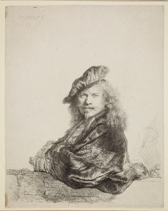
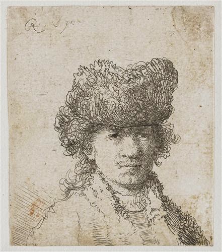
  • Three should be of your face and experiment with different lighting (moving a desk lamp for example to create dramatic lighting effects) and facial expressions (see rembrandt below)...
  • Two should be of your full body and enable you to further practice your foreshortening skills. 


Remember from class...

...Try to see your (objects) face as being larger than life and having monumental qualities. Imagine them being as tall as the Eiffel Tower - a landscape to walk across - or an island in the sea, around which you could fly a helicopter. Visualise the spaces between them as being alive - sea, sand, sky.

...Results:
On completion of this drawing you will have carved into the surface of charcoal covered paper and revealed an illusion of the visible world. In a similar way to the way in which Michelangelo found his figures in a piece of stone. You will begin to recognise the flexible beauty of charcoal, and this subtractive all over way of using it to make drawings.  

Rembrandt experimenting with capturing different expressions...


Week 5: Life Drawing Session 4; Subtractive Tone

ANIM1003: Life and Observational Drawing


Subtractive Tone
This drawing is the opposite of other drawing methods, in which dark marks are added to white paper. A drawing can be made by covering a piece of paper in charcoal and then rubbing into it to reveal the paper. The white of the paper is revealed as a positive negative, and at is whitest, it reads as a highlight - the lightest tone. A range of mid-tones can be made by rubbing out more or less charcoal.

Try to see your objects as being larger than life and having monumental qualities. Imagine them being as tall as the Eiffel Tower - a landscape to walk across - or an island in the sea, around which you could fly a helicopter. Visualise the spaces between them as being alive - sea, sand, sky.

1)    Cover the whole of the drawing paper with charcoal, edge to edge, in a mid-to dark tone, by using the side of the charcoal stick, and a tissue or old cotton rag to slightly rub the charcoal into the surface of the paper.
Imagine being in a dark room, where nothing is visible, and you have a dimmer switch for the light - gradually turn the switch on and the objects and the space become visible. Your blackened piece of paper is the dark room, and your erasers and rags are the dimmer switch. You will gradually reveal your composition by taking the darkness away, and revealing light through the whiteness of the paper. 
Imagine you are Michelangelo chipping away at a large piece of stone. Your charcoal blackened piece of paper is the equivalent of Michelangelo’s stone. You now have to use the eraser as a chisel and carve into the darkness to reveal.
Start by drawing/describing the negative space and creating a context for the model.

2) With your eraser start to take the darkness out of the negative space. Look very carefully to establish the areas of most and least light. You will need to erase right back to the paper for an equivalent of most light, and will probably have to add more charcoal for your darkest areas. Establish the lightest areas first and have in mind that you are trying to create a feeling of light.

3) Keep looking and comparing the tones of all the parts, each area against another “this is lighter, this is darker” etc.

4) Use the cloth, the eraser, your fingers, a soft brush, and the ball of your hand to adjust and integrate the negative light of the paper and the charcoal. You might like to describe the light as soft, gentle, dappled, or harsh - so make your rubbed out marks accordingly. It might help to think of your drawing as a black and white reproduction of an Impressionist painting, where the negative dabs of light left by the putty rubber are the equivalent of lots of relatively small brush marks.

5) Show that the surface of the paper that the model is standing on passes underneath them, and that at the same time, the light in the negative space is behind, between and wrapping around them.

6) When you have dealt with the negative space, and start working on the objects, it may be necessary to define them a bit more clearly at their edge.

7) Use the pointed end of a piece of charcoal to make short, slightly stabbed marks, or slide the side of the charcoal stick to define any bits of contour, and integrate the marks into the picture space with your finger.

8) Wherever possible, make a feature out of any incidental detail, quirky or particular characteristic. The eye needs to be offered moments of interest in the drawing. Mould your eraser into a point to get at the details. Gradually as you begin to work on the figure, it will seat itself into the background and it will probably be necessary to re-work some of the background at the same time.

9) Do not be afraid to use your cloth and rub out areas that you are unhappy with in order to restructure your drawing. Charcoal is very flexible.

Results:
On completion of this drawing you will have carved into the surface of charcoal covered paper and revealed an illusion of the visible world. In a similar way to the way in which Michelangelo found his figures in a piece of stone. You will begin to recognise the flexible beauty of charcoal, and this subtractive all over way of using it to make drawings.  

Monday 17 October 2016

Week4 Homework: Drawing Your Hand Holding Different Household Objects

Drawing/Painting Your Hand Holding Different Objects

In this exercise, you will make five drawings and/or paintings of your hand holding different objects. Holding an object in your hand while you draw it will add compositional interest and provide new creative and technical challenges. Spend at least 45 minutes on each image and challenge yourself to remain focused for the entire time you are working on it.

Before you begin to make your image think about how the posing or position of the hand, the object it is holding, the composition and the use of colour and technique can infer narratives to the viewer and promote different emotional responses. Experiment with different objects and techniques to see what responses you can illicit. Don't just start drawing in the centre of the page. THINK ABOUT COMPOSITION. THINK ABOUT HAND POSITION. THINK ABOUT THE OBJECT YOU ARE HOLDING...
...Make your drawing as exciting to you as it should be to the viewer.

Use a range of drawing materials including coloured pastels, pencils and paint (watercolour, gouache or acrylic paint) and ink.

Upload the finished drawings to your blog and write a few lines reflecting on the experience of completing this task. You could ask yourself the following questions...
  • Are you struggling with the process or are you finding it straight forward? 
  • How does this make you feel and how has it affected your creative/design decisions? 
  • Did you gain any insights this week about your work/processes/progression that surprised you? 
  • Have your expectations about your development in drawing practice been met? 
  • Or do you feel you have exceeded them or have you failed to have met them? 
  • Why is this and where is the evidence to demonstrate this?
As a student on this module you must now start to take ownership of the tasks presented to you!
Are you fully engaged with and excited by each drawing?

Experiment with media, process and technique. Make it yours!
Go for it!!

Week4 Life Drawing Session 3: Foreshortening


ANIM1003: Life and Observational Drawing 3
Foreshortening

Foreshortening is the modification of an established scale in a drawing of the human figure to represent perspective. Unlike linear perspective, there is no need for vanishing points, however one has the option of using such methods if the figure is lying down or standing up in such a way that a three dimensional rectangular cube could be drawn in perspective to encompass the figure and be used as a guide.

More often than not, foreshortening is a matter of observation and drawing what you see, as opposed to what your logical brain thinks you see. When you start to draw an object that is foreshortened, your logical side of your brain kicks in and tries to convince you to draw what it knows the object looks like. You need to be able to override that left brain function and let the right side, the creative side, take over and draw exactly what you see.

Foreshortening is when an object appears to be receding into the distance or coming straight out at you. When something gets foreshortened, proportion is skewed and the size of the object is distorted to make the object appear closer to you. Foreshortening can be remembered easily by its descriptive nature because whether an arm or leg extends backwards or forwards it appears to be shorter than its actual dimensions. Another rule of thumb goes as follows: part(s) of the figure closest to the viewer should be drawn larger, almost exaggeratedly so.

Also, a common technique for drawing the foreshortened figure is to incorporate greater definition and detailing to the foreground while leaving the middle and background sketchier.

///////////////////////////////////////////////////////////////////////////////////////////////////////////////////////////////////////////////////////////

Workshop

We will be experimenting with foreshortening. We will mark the joints with tape - this should make it easier to calculate the differences between the different parts of the body and ensure that you have everything in the correct proportion and in perspective. Use your pencil to measure distances and angles.
(4 x 45 minute drawings).
The emphasis on these exercises is to get the foreshortening correct so pay special attention to the perspective and proportion of your drawing.

///////////////////////////////////////////////////////////////////////////////////////////////////////////////////////////////////////////////////////////

Next Week

Please bring charcoal and a rubber to the session…